
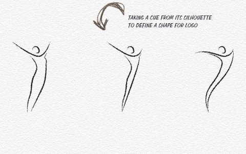
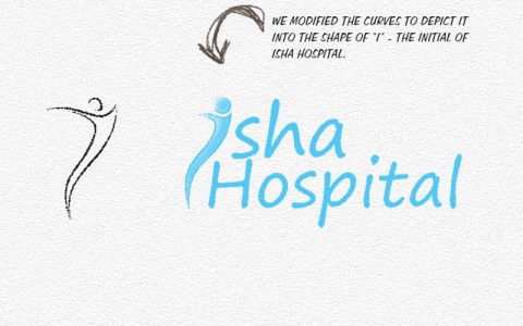
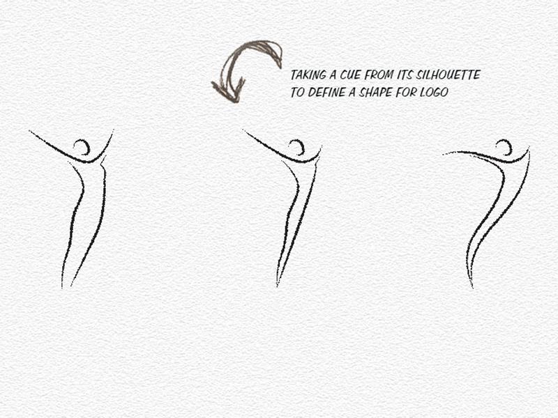
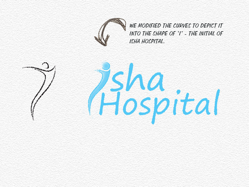
The alphabet ‘I’ is exclusively carved into curves to depict a figure, implying Feminity and Freedom … the freedom from health worries and stress and the freedom to live a carefree life.
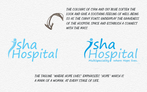
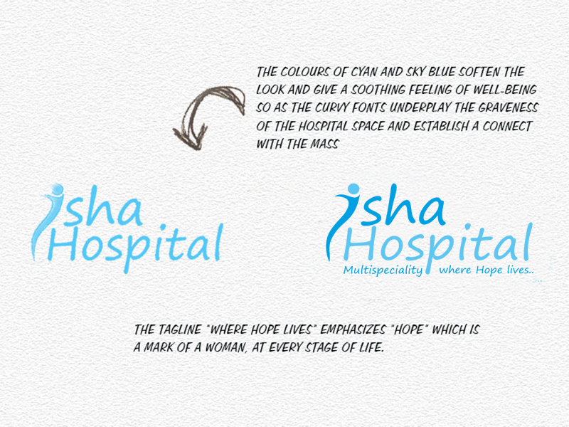
The colours of cyan and sky blue soften the look and give a soothing feeling of well-being. The curvy fonts underplay the graveness of the hospital space and establish a connect with the masses.
The tagline “Where Hope lives” emphasizes “hope” which is a mark of a woman, at every stage of life.